
Data-Storytelling with AI: Making Numbers Compelling


UIC University 365 Institute of Communication
Series Content Strategy Series | Level Basic (Free)
Duration 15 to 20 minutes | Access Free
Digital Communication, Marketing, Branding, Content Strategy, Media Studies

UNOP Sound (University 365 Neuroscience Oriented Pedagogy)
Take five minutes to prepare your brain. Play the isochronous tone track (40Hz gamma frequency) with your eyes closed. Gamma-frequency tones before a learning session raise attention and make the material easier to absorb.
[Audio player: UNOP Pre-Lecture Isochrone (40Hz, 5 minutes)]
In this Lecture

The Hook: A Spreadsheet Changed No Minds
You spent three weeks collecting the data. You built a 200-row spreadsheet with 12 columns, conditional formatting, and a pivot table. You presented it to your team. Nobody changed their mind. Nobody approved the budget. Nobody took action.
The data was correct. The presentation was the problem. Rows of numbers do not persuade people. Stories do.
Data storytelling is the discipline of combining data, visualizations, and narrative to make numbers understandable and actionable. In 2026, AI tools have transformed this discipline. You no longer need a data scientist, a graphic designer, and a copywriter to produce a compelling data story. You need one person who understands the question, the audience, and how to direct AI tools to do the heavy lifting.
This lecture teaches you the 7-step pipeline for turning raw data into compelling visual narratives using AI. You will learn the three major AI-powered BI platforms (Tableau AI, Power BI Copilot, and Google Looker), how to choose the right chart type with AI assistance, how to generate infographics from data, and how to apply data journalism techniques with AI support. Throughout, you will apply the CI-First approach: the human directs the story, and AI amplifies the execution.
Step 1: The Data Storytelling Gap
The Problem
Every organization collects data. Sales figures, website analytics, customer feedback, market research, operational metrics. The volume grows every quarter. But the ability to communicate what that data means has not kept pace.
A 2025 Gartner study found that 70% of business leaders say their teams produce data reports that are "technically accurate but decision-useless." The reports contain the right numbers. They do not answer the question the decision-maker is actually asking. They do not prioritize the most important finding. They do not provide context. They present data without a story.
What Data Storytelling Adds
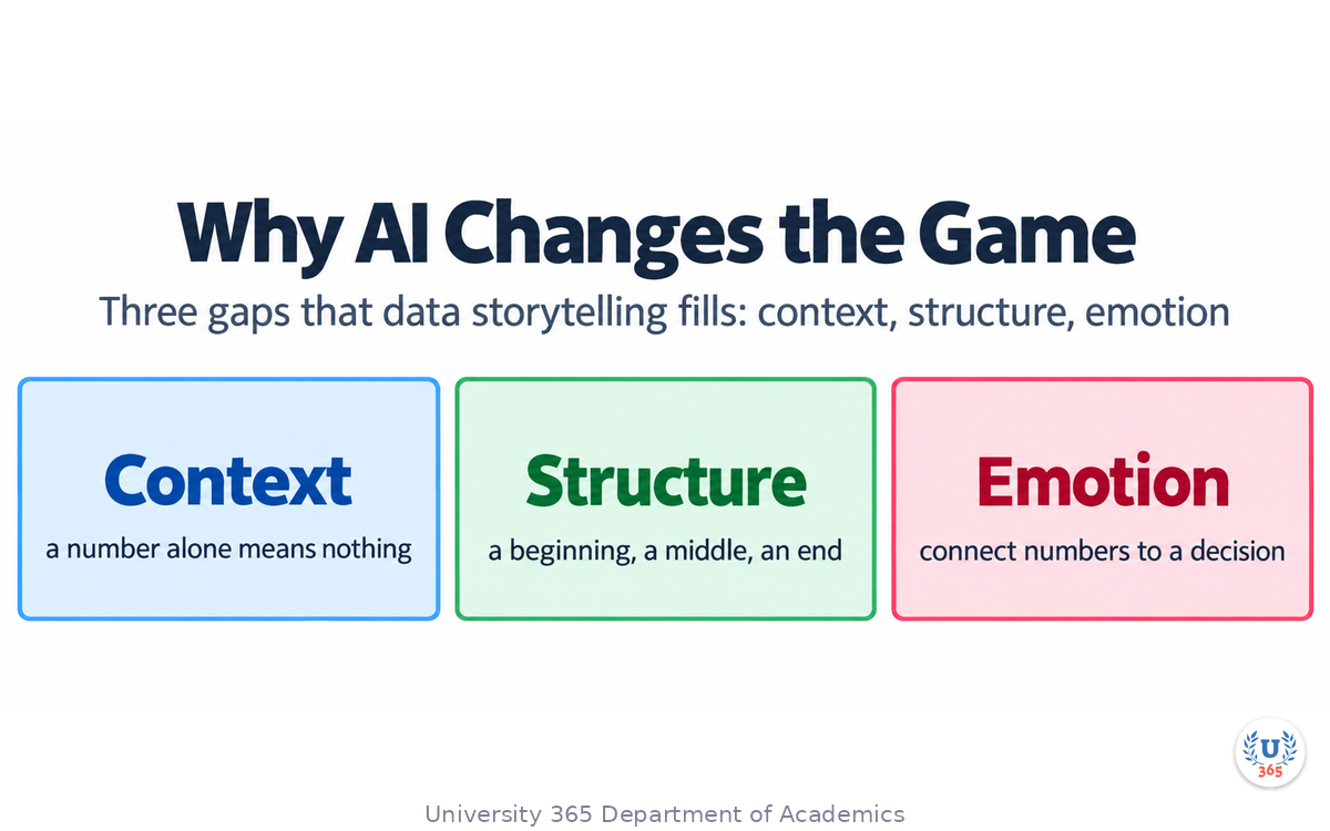
Data storytelling fills three gaps that raw data and standard dashboards leave open:
Context: A number without context is meaningless. Revenue of $2.4 million means nothing without knowing whether it is up or down, compared to what, and whether that is good or bad. The story provides the comparison, the benchmark, and the interpretation.
Structure: A dashboard shows everything at once. A story has a beginning (the question), a middle (the analysis), and an end (the recommendation). Structure guides the audience through the data in the order that builds understanding.
Emotion: Humans make decisions based on emotion and justify them with logic. A data story connects the numbers to consequences: what happens if the trend continues, who is affected, what is at stake. This is not manipulation. It is relevance.
Why AI Changes the Game
Before AI, data storytelling required three specialized roles:
A data analyst to clean, process, and analyze the data
A visualization designer to choose chart types, design layouts, and create graphics
A communication professional to write the narrative and structure the presentation
In 2026, AI tools handle the mechanical work of all three roles. The AI can clean data, suggest chart types, generate visualizations, draft narrative summaries, and produce infographics. What AI cannot do is decide what matters. That is your job. The CI-First approach positions you as the director: you define the question, select the audience, determine the key message, and verify the AI output. AI is the amplifier, not the orchestrator.
Step 2: Three AI-Powered BI Platforms Reshaping Communication
The three dominant business intelligence platforms in 2026 have all integrated AI capabilities that transform how communication professionals interact with data.
Tableau AI (Tableau Cloud and Tableau Next)
Tableau has built AI into every layer of its platform. The key features for data storytellers:
Concierge (GA as of February 2026): Natural-language Q&A. You type "Show last quarter's sales by region" and Tableau returns a visualization along with the semantic model, metrics, and filters it used. Transparency is built in: you can see exactly how the AI interpreted your question.
Dashboard Narratives (2026.1 and later): Analyzes your dashboard and generates a written summary of the key findings. This is the AI reading your charts and writing the story for you. You edit, verify, and refine.
Tableau Agent in Viz Authoring: Acts as an AI assistant for building visualizations. You can say "Show this as a bar chart" or "Add labels to the end of bars" or "Color-code by region." The AI handles the formatting.
Pulse Insight Summaries: Automatically generates natural-language summaries of your most important metrics. Instead of checking 15 dashboards, you read a paragraph that tells you what changed and why it matters.
Dashboard MCP Support (GA August 2026): Generate, assemble, and update multi-page dashboards conversationally using natural language through Model Context Protocol integration.
Power BI Copilot (Microsoft)
Power BI has integrated Copilot across the entire workflow:
Copilot Narrative Visual: Generates written narratives directly inside Power BI reports. The AI reads the visuals on the page and produces a summary paragraph. As of August 2026, it can even read visuals hidden behind bookmarks.
Copilot Summary: Summarizes an entire report page or topic. Useful for executives who need the key takeaways without exploring every chart.
Chat with your data: The standalone Copilot experience lets business users ask questions about any data item in natural language. No DAX formulas required.
Smart Narrative (AI visual): An older but still useful feature that generates text summaries based on the current filter context. It updates dynamically as you interact with the report.
Google Looker (with Gemini)
Google rebranded Looker Studio back to Data Studio in April 2026, but the enterprise product remains Looker. The AI features are powered by Gemini:
Visualization Assistant (GA): Use natural language to create and refine charts. Ask to change a drafted visual to a stacked bar chart or color-code by region, and Gemini handles it.
Expression Assistant (Preview): Generate custom dimensions, measures, and filters by describing your desired logic in plain English. No more remembering LookML syntax.
Insight Assistant (Preview): Automatically generates summaries and points to key trends within reports. It identifies the "so what" behind the numbers.
Conversational Analytics: Natural-language data querying powered by BigQuery agents. Available on the free tier as of May 2026.
AI-assisted Quick Start: Eliminates the cold start from an empty canvas. Looker generates an ad hoc starting query using Gemini, suggesting questions the data can tackle.
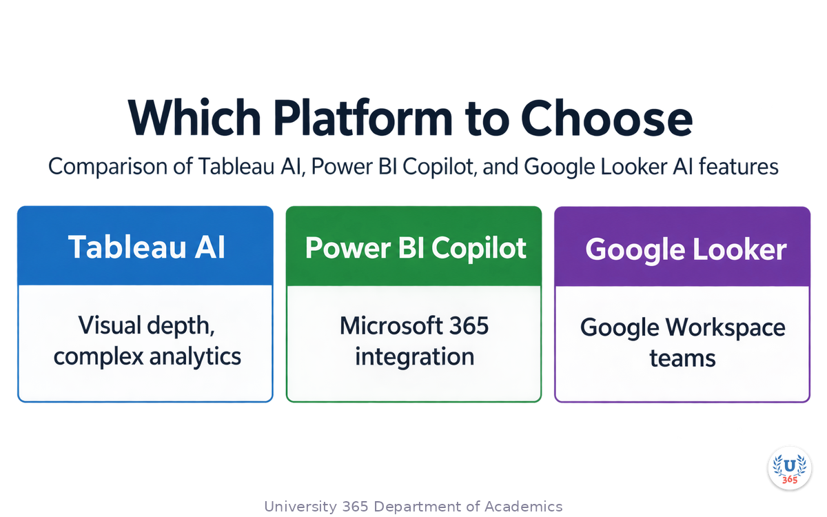
Which Platform to Choose
Platform | Best For | AI Strength | Pricing Model |
Tableau AI | Visual depth, complex analytics | Dashboard Narratives, natural-language Q&A | Per user/month, Cloud+ or Tableau+ for AI features |
Power BI Copilot | Microsoft 365 integration | Narrative Visual, Copilot Summary | Included with Microsoft 365 + Copilot license |
Google Looker | Google Workspace teams, startups | Visualization Assistant, Gemini-powered | Free tier available, Pro for Gemini features |
The platform matters less than the practice. All three can produce data stories. The question is which one fits your existing workflow, your data infrastructure, and your team's skill level.
Step 3: Turning Raw Data into Narrative with AI
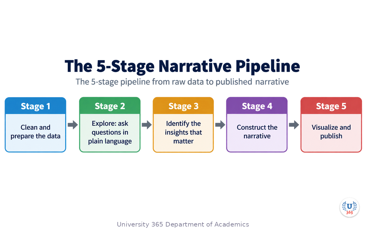
The 5-Stage Narrative Pipeline
Turning a spreadsheet into a story is not a single step. It is a pipeline of five stages, each of which AI can accelerate:
Stage 1: Data Cleaning and Preparation
AI tools can automatically detect and suggest fixes for common data quality issues: missing values, inconsistent formats, duplicate records, and outliers. Tableau's Data Prep Assistant learns from your corrections. Power BI Copilot can write DAX formulas from natural language descriptions. Google Looker's Expression Assistant generates custom dimensions and measures from plain English.
The human role: verify that the cleaning rules match your domain knowledge. AI may not know that a revenue value of $0 means "not applicable" in your context, not "zero revenue."
Stage 2: Exploratory Analysis
Ask the AI questions in natural language. "What is the trend in customer acquisition over the last 6 months?" "Which product category has the highest margin?" "Is there a correlation between marketing spend and sales?" The AI queries the data, produces a visualization, and explains what it found.
The human role: ask the right questions. The AI answers whatever you ask. If you ask the wrong question, you get a precise answer to the wrong thing. This is where domain expertise and the CI-First approach matter most.
Stage 3: Insight Identification
AI can identify patterns that humans miss: anomalies, clusters, trends, correlations. Tableau Pulse generates insight summaries automatically. Power BI Copilot flags key changes. Google Looker's Insight Assistant surfaces trends.
The human role: evaluate which findings are meaningful and which are statistical noise. Not every correlation is causation. Not every anomaly is important. You decide what enters the story.
Stage 4: Narrative Construction
This is where data becomes story. The AI can draft a narrative summary of the key findings. It can structure the story with a hook (the question), a body (the evidence), and a conclusion (the recommendation). It can adjust the tone for different audiences: executive summary, technical report, social media post.
The human role: verify accuracy, add context the AI lacks, and ensure the narrative serves the decision. The AI can write "Sales increased 15% in Q3." It cannot know that the increase was driven by a one-time contract that will not recur unless you tell it.
Stage 5: Visualization and Publication
The AI produces the final visual artifacts: charts, dashboards, infographics. It can format them for different channels: presentation slides, web pages, social media posts, email reports.
The human role: review for clarity, accuracy, and ethical presentation. Check that the chart type matches the data relationship. Verify that the color choices do not mislead. Ensure the scale is not truncated to exaggerate differences.
Step 4: Choosing the Right Chart Type with AI Assistance
The Fundamental Principle
The chart type follows the question, not the other way around. This is the most important rule in data visualization. If you start by picking a chart type and then looking for data to fill it, you have already failed.
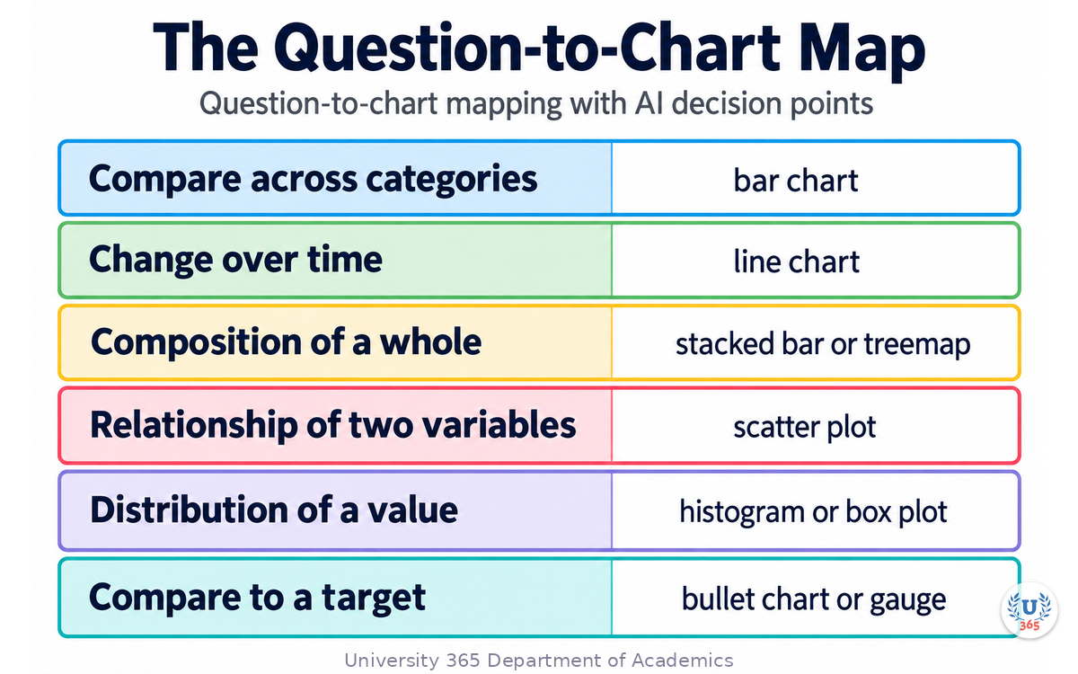
The Question-to-Chart Map
AI tools can suggest chart types based on your data and your question. But you need to know the fundamental relationships to verify their suggestions:
Your Question | Chart Type | Why |
How do values compare across categories? | Bar chart | Length is preattentively processed; accurate comparison |
How does a value change over time? | Line chart | Slope encodes rate of change; continuity implies sequence |
What is the composition of a whole? | Stacked bar or treemap | Shows parts and total simultaneously |
What is the relationship between two variables? | Scatter plot | Position on two axes reveals correlation |
How is a value distributed? | Histogram or box plot | Shows shape, spread, and outliers |
How does a single value compare to a target? | Bullet chart or gauge | Compact, goal-oriented |
What is the flow between categories? | Sankey diagram or funnel | Shows volume and direction of movement |
What is the geographic distribution? | Choropleth map | Location and value in one view |
What AI Gets Wrong
AI chart suggestions are good but not perfect. The three most common errors:
Defaulting to pie charts. Pie charts are visually appealing but cognitively inefficient. Humans compare angles poorly. A bar chart almost always communicates the same information more clearly. AI tools often suggest pie charts because they look polished. Override this suggestion when you have more than 3 categories.
Overloading a single chart. AI may try to show 8 series on one chart with 8 colors. The result is a chart no one can read. When the AI suggests more than 4 series, split into multiple charts or use small multiples.
Ignoring the audience. AI does not know whether your audience is a CFO who wants the bottom line or a data scientist who wants the methodology. You must specify the audience when asking for chart suggestions. The same data may warrant a single KPI card for an executive and a detailed scatter plot for an analyst.
The Truncated Axis Trap
The most common form of data visualization deception is the truncated Y-axis. A bar chart that starts at 95 instead of 0 makes a 2% difference look like a 50% difference. AI tools generally default to starting axes at 0 for bar charts, but they may truncate axes for line charts to show variation. Always check the axis scale. If the AI truncated the axis, ask whether the variation it shows is meaningful or exaggerated.
Step 5: AI Infographic Generation: From Data to Visual Story
What Has Changed
Infographics used to require a graphic designer, specialized software (Illustrator, InDesign), and hours of manual work. In 2026, AI infographic generators can produce a first draft in under 30 seconds from a prompt, a CSV file, or a document upload.
The Leading AI Infographic Tools
Infogram: Built for data storytelling. 35+ chart types, 800+ maps, interactive charts with hover effects and animations. AI suggests charts, adjusts content, and converts images into data. Best for web-embedded infographics where interactivity matters.
Piktochart: Best for reports, guides, and educational infographics. AI generates a structured outline from your prompt or document, then produces an editable infographic draft. 60 free AI credits per month. Strong for long-form, content-heavy visuals.
Venngage: Best for business and data infographics. AI chart generation from uploaded data, AI Designer chatbot for iterative refinement, Brand Kit for consistent visual identity. AI can recommend better chart types based on your data.
InfoArt.ai: Uses a two-model pipeline: Claude interprets your intent and structures the narrative, Imagen composes the visual. Exports to PPTX, PNG, or live embed. Emphasis on editorial-quality visuals, not template-filling.
Canva Magic Design: Best for simple marketing infographics. Massive template library, real-time collaboration, Magic Switch for format adaptation. Less specialized for data but accessible for non-technical users.
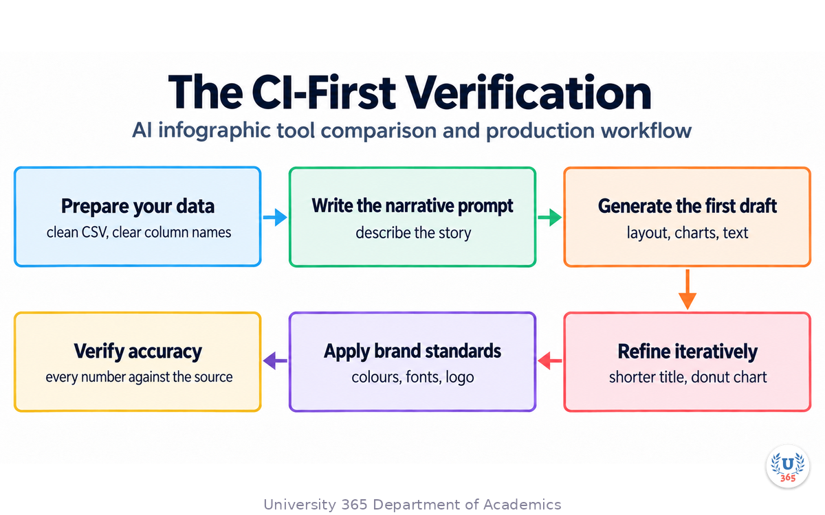
The Infographic Production Workflow with AI
Prepare your data: Clean CSV or spreadsheet with clear column names. The AI needs structured input to produce accurate charts.
Write the narrative prompt: Describe the story, not just the data. "Show how our customer acquisition cost has decreased 30% over 6 months while conversion rate increased from 2.1% to 3.8%" is better than "Make an infographic about marketing metrics."
Generate the first draft: Let the AI produce the layout, charts, and initial text.
Refine iteratively: "Make it warmer." "Swap to donut chart." "Shorter title." "Add the source citation." AI infographic tools hold context between turns.
Apply brand standards: Use Brand Kit features to apply your colors, fonts, and logo consistently.
Verify data accuracy: Check every number in the infographic against your source data. AI can transpose digits, mislabel axes, or use outdated figures.
Export and distribute: PNG for web, SVG for print, PPTX for presentations, embed code for interactive web infographics.
The CI-First Verification
AI infographics are fast but not always accurate. The speed of generation can create a false sense of confidence. Before publishing any AI-generated infographic, verify:
Every number matches the source data
The chart type matches the data relationship
The color scheme does not imply a hierarchy that does not exist
The title accurately reflects the content
Sources are cited
The visual does not mislead through scale, proportion, or omission
Step 6: Data Journalism Techniques with AI
What Data Journalism Teaches Communication Professionals
Data journalism is the practice of finding stories in data. Journalists at publications like The New York Times, The Guardian, and FiveThirtyEight have developed techniques for turning datasets into narratives that millions of people read. These techniques apply directly to organizational communication.
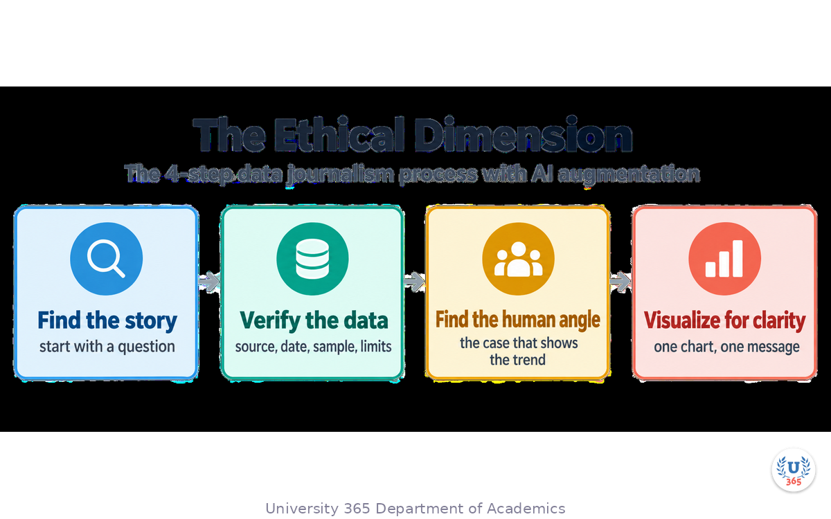
The 4-Step Data Journalism Process
Step 1: Find the Story
Journalists do not start with data. They start with a question. "Why are housing prices rising faster in some neighborhoods?" "Which schools have the largest achievement gap?" "How does campaign spending correlate with election results?"
AI accelerates this step by scanning large datasets for anomalies, trends, and outliers. You can ask an AI tool: "What is the most surprising pattern in this dataset?" The AI will surface candidates. You evaluate which ones are both true and interesting.
Step 2: Verify the Data
Journalists verify everything. Where did the data come from? Is it complete? Is it current? Are there known biases in the collection method? AI can help by flagging missing values, identifying outliers, and checking for internal consistency. But the judgment about whether the data is trustworthy is human.
Key verification questions:
What is the source? Government data, proprietary research, user-generated?
When was it collected? Is it still current?
What is the sample size? Is it representative?
Are there known limitations or caveats?
Step 3: Find the Human Angle
Data without a human connection is abstract. The best data stories connect numbers to people. A 15% unemployment rate is a statistic. The story of one person who lost their job and found a new one is a narrative. AI can help identify the representative cases: which individual data points best illustrate the aggregate trend.
The technique: find the outlier that represents the trend. Not the anomaly that contradicts it. The specific case that makes the general pattern tangible.
Step 4: Visualize for Clarity
Data journalism visualizations follow three rules:
One chart, one message. Do not try to tell five stories in one chart.
Annotate the key point. If the chart has a spike, label the spike and explain what caused it.
Show the data, not the decoration. Remove gridlines, shadows, 3D effects, and unnecessary labels.
AI tools can generate the visualization. You provide the annotation and the explanation.
AI Tools for Data Journalism
ChatGPT and Claude: For exploratory analysis, hypothesis generation, and narrative drafting. Upload a CSV and ask "What story does this data tell?"
Julius AI: Specialized for data analysis. Can run statistical tests, generate charts, and answer questions about uploaded datasets.
Tableau Pulse: For ongoing monitoring of metrics with automatic insight generation.
Google Conversational Analytics: For querying BigQuery datasets in natural language.
The Ethical Dimension
Data journalism has a code: do not mislead. This applies equally to organizational communication. The same techniques that can make data compelling can also make data deceptive. Truncated axes, cherry-picked time periods, misleading color scales, and omitted context are the common sins.
The CI-First approach is your safeguard. You are the human intelligence that verifies the AI output. If the AI produces a chart that technically answers the question but misleads the audience, you must fix it. Speed is not an excuse for inaccuracy.
Step 7: The CI-First Approach to Data Communication
What CI-First Means for Data Stories
CI-First (Co-Intelligence First) is the University 365 principle that human intelligence directs and AI amplifies. In data storytelling, this means:
The Human Directs:
What question are we answering?
Who is the audience?
What is the key message?
What data is relevant?
What is the ethical boundary?
The AI Amplifies:
Cleaning and processing the data
Generating chart suggestions
Drafting narrative summaries
Producing infographic layouts
Checking for statistical patterns
The Verification Protocol
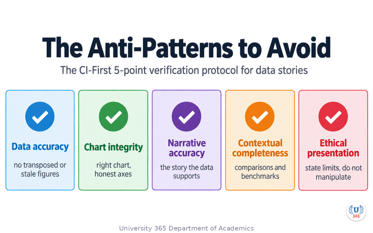
Every AI-assisted data story passes through a 5-point verification before publication:
Data accuracy: Every number in the story matches the source data. No transposed digits, no rounded figures presented as exact, no outdated values.
Chart integrity: The chart type matches the data relationship. Axes start at the appropriate value. Colors do not imply false hierarchy. The visual does not exaggerate through scale manipulation.
Narrative accuracy: The story the AI tells is the story the data supports. No causal claims from correlational data. No projections without stated assumptions. No conclusions beyond the evidence.
Contextual completeness: The story includes the comparisons, benchmarks, and background the audience needs. A number without context is not a story. It is a factoid.
Ethical presentation: The story does not use data to manipulate. It presents evidence honestly, acknowledges limitations, and lets the audience draw conclusions.
The Anti-Patterns to Avoid
The AI Trust Trap: The AI produced a beautiful chart with a clear narrative in 10 seconds. It must be correct. This is the most dangerous assumption in AI-assisted data storytelling. Speed and polish do not equal accuracy. Verify every time.
The Default Acceptance Trap: The AI suggested a pie chart. It looks fine. Accept it. Wrong. Pie charts are almost always the wrong choice for more than 3 categories. Question the default.
The Single-Source Trap: The AI analyzed one dataset and produced a definitive conclusion. But one dataset is one perspective. Cross-check with other sources when possible. The AI does not know what data you are not showing it.
The Complexity Trap: The AI can produce a 40-chart dashboard with real-time updates and predictive analytics. Your audience needs one number and one recommendation. Complexity is not sophistication. Clarity is.
Feynman Summary: Explain It Like You Are 12
Imagine you have a big box of Lego pieces. Each piece is a number: how many shoes you sold, how many people visited your store, how much money you made. The pieces are all mixed up in the box.
You could dump the box on the table and say "Here are all the numbers." That is what a spreadsheet does. Your friend looks at the pile and says "So what?"
Or you could sort the pieces, pick the most important ones, and build a picture that shows something interesting. "Look, every time we put up a sign, more people came in." That is data storytelling. You turned a pile of numbers into a picture that makes someone say "Oh, I get it."
AI is like a helper who can sort the Lego pieces really fast, suggest which pieces to use, and even build a first draft of the picture. But you are the one who decides what picture to build and whether it actually shows something true.
The rule is simple: the chart follows the question, not the other way around. First decide what you want to know. Then let AI help you show it. Then check that what the AI built is actually correct before you show it to anyone.
That is data storytelling with AI. You direct, AI builds, you verify.
Mindmap: The Complete Picture
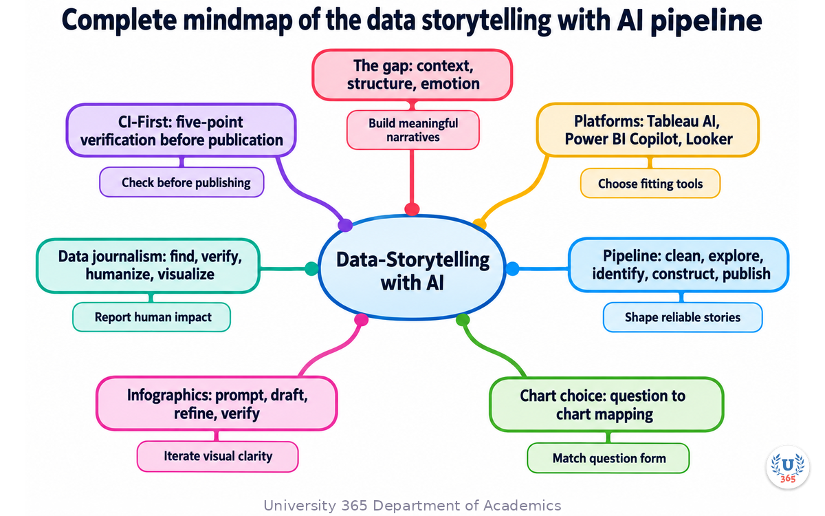
The mindmap shows the full structure of what you learned: the data storytelling gap (context, structure, emotion) feeds into the three BI platforms (Tableau AI, Power BI Copilot, Google Looker), which support the 5-stage narrative pipeline (clean, explore, identify, construct, publish), which uses AI-assisted chart selection (question-to-chart mapping), AI infographic generation (Infogram, Piktochart, Venngage), data journalism techniques (find, verify, humanize, visualize), all wrapped in the CI-First verification protocol (data accuracy, chart integrity, narrative accuracy, contextual completeness, ethical presentation).
UNOP Sound (University 365 Neuroscience Oriented Pedagogy)
Take five minutes to consolidate your memory. Play the isochronous tone track (10Hz alpha frequency) with your eyes closed. Alpha-frequency tones after a learning session support consolidation, helping move what you just learned from short-term to long-term memory.
[Audio player: UNOP Post-Lecture Isochrone (10Hz, 5 minutes)]
Practical Exercise: Build a Data Story with AI
Exercise: From Spreadsheet to Story in 30 Minutes
You will use a free AI tool to turn a simple dataset into a data story. No prior experience required.
Materials needed:
A dataset (use the sample provided below or your own)
Access to an AI chat tool (ChatGPT, Claude, or Google Gemini)
30 minutes
Sample dataset: Create a simple CSV with monthly website traffic data:
Month,Visitors,Conversions,Revenue Jan,4200,84,4200 Feb,4800,108,5400 Mar,5100,122,6100 Apr,4900,98,4900 May,6200,186,9300 Jun,7100,248,12400
Step 1: Ask the AI to analyze the data (5 minutes)
Copy the CSV into your AI tool and ask: "Analyze this dataset. What are the three most important patterns? What questions does this data answer?"
Review the AI's response. Did it identify the conversion rate improvement from 2% in January to 3.5% in June? Did it notice the revenue jump in May and June? Did it flag the April dip?
Step 2: Ask the AI to recommend chart types (5 minutes)
Ask: "What chart type would best show the relationship between visitors and conversions over time? What chart type would best show the revenue trend?"
The AI should suggest a dual-axis chart or a line chart with a secondary axis for visitors vs. conversions, and a bar chart or line chart for revenue. Evaluate whether these suggestions match the question-to-chart map you learned in Step 4.
Step 3: Ask the AI to draft a narrative (10 minutes)
Ask: "Write a 3-paragraph data story about this dataset for an executive audience. Start with the key finding, provide the evidence, and end with a recommendation."
Review the narrative. Does the AI make any causal claims that the data does not support? Does it provide context (comparison to industry benchmarks, for example)? Does the recommendation follow from the evidence?
Step 4: Identify the human angle (5 minutes)
Ask: "Which single month best represents the overall trend? If I were to tell this story with one data point, which would it be?"
The AI should identify June as the peak month or May as the turning point. Use this to add a specific, concrete example to your narrative.
Step 5: Verify and refine (5 minutes)
Check every number in the AI's narrative against the source data. Check that the chart suggestions follow the question-to-chart map. Check that the narrative does not overstate causation.
What to Look For
The AI will likely identify the conversion rate improvement as the key story. This is correct: the conversion rate went from 2.0% to 3.5%, a 75% improvement. That is more interesting than the raw visitor increase.
The AI may suggest a pie chart for the revenue distribution by month. Override this: a bar chart is clearer for time-series comparison.
The AI may claim that the May increase was "due to" some factor. Unless you provided that context, this is an unsupported causal claim. Remove it.
Applied AI Connection
This exercise demonstrates the CI-First approach in practice. The AI did the analysis, suggested charts, and drafted the narrative. You directed the questions, verified the output, and made the final editorial decisions. This is the workflow you will use in every AI-assisted data story: direct, amplify, verify.
Glossary
Term | Definition |
**Data Storytelling** | The discipline of combining data, visualizations, and narrative to make numbers understandable and actionable. |
**CI-First** | Co-Intelligence First: the principle that human intelligence directs and AI amplifies. The human is the orchestrator. |
**Tableau AI** | AI features integrated into Tableau Cloud and Tableau Next, including Concierge, Dashboard Narratives, and Pulse. |
**Power BI Copilot** | Microsoft's AI assistant integrated into Power BI for narrative generation, data summarization, and natural-language querying. |
**Google Looker** | Google's enterprise BI platform with Gemini-powered features including Visualization Assistant, Expression Assistant, and Insight Assistant. |
**Dashboard Narratives** | AI-generated written summaries of dashboard visualizations. Available in Tableau (2026.1+) and Power BI (Copilot Narrative Visual). |
**Natural-Language Q&A** | The ability to ask data questions in plain English and receive visualizations and explanations in response. |
**Chart Type Selection** | The process of matching a visualization type to the data relationship and the question being asked. |
**Question-to-Chart Map** | The principle that chart type follows the question: comparisons use bars, trends use lines, composition uses stacked bars, correlation uses scatter plots. |
**Truncated Axis** | A chart axis that does not start at zero, which can exaggerate differences. The most common form of data visualization deception. |
**Infographic** | A visual representation of information or data designed to communicate a message quickly and clearly. |
**Data Journalism** | The practice of finding, verifying, and communicating stories found in data. |
**5-Stage Narrative Pipeline** | The process of turning data into story: clean, explore, identify, construct, publish. |
**Insight Identification** | The process of finding patterns, anomalies, and trends in data that are both true and interesting. |
**Verification Protocol** | The 5-point CI-First check for data stories: data accuracy, chart integrity, narrative accuracy, contextual completeness, ethical presentation. |
**Pulse** | Tableau's feature that generates natural-language summaries of important metrics automatically. |
**Expression Assistant** | Google Looker's AI feature for generating custom dimensions, measures, and filters from plain English descriptions. |
**Visualization Assistant** | Google Looker's GA feature for creating and refining charts using natural language. |
**Brand Kit** | A feature in AI infographic tools that applies consistent colors, fonts, and logos across all generated visuals. |
**Small Multiples** | A series of small charts using the same scale and axes, allowing comparison across categories or time periods. |
Quiz: TEST YOUR UNDERSTANDING
1. What is the most important principle when choosing a chart type?
A) Pick the chart that looks most professional
B) The chart type follows the question you are answering
C) Use whatever chart the AI tool suggests by default
D) Always use pie charts for categorical data
2. Which AI feature in Tableau generates written summaries of dashboard findings?
A) Pulse Insight Summaries
B) Dashboard Narratives
C) Expression Assistant
D) Visualization Assistant
3. What is the truncated axis trap in data visualization?
A) Using too few data points on a chart
B) A chart axis that does not start at zero, exaggerating differences
C) Cutting off data labels to save space
D) Removing outliers from the dataset
4. In the CI-First approach to data storytelling, what is the human's role?
A) Clean the data and generate charts
B) Direct the question, verify the output, and ensure ethical presentation
C) Write the narrative summary automatically
D) Choose the color scheme for infographics
5. What is the first step in the data journalism process?
A) Visualize the data
B) Find the story by asking a question
C) Verify the data source
D) Generate an infographic
6. Why should you generally avoid pie charts for more than 3 categories?
A) They are too small to read
B) Humans compare angles poorly, making differences hard to perceive
C) AI tools cannot generate them
D) They require too many colors
Answers: 1-B, 2-B, 3-B, 4-B, 5-B, 6-B
Related Resources
U365 INSIDE Publications
Lecture 1: AI Content Generation: Beyond ChatGPT: The AI content generation landscape and multi-tool pipeline (UIC Content Strategy Series, Lecture 1)
Lecture 3: AI for Social Media Strategy: Social media analytics and AI-driven content distribution (UIC Content Strategy Series, Lecture 3, coming soon)
External Resources
Tableau AI Features Documentation: help.tableau.com/current/tableau/en-us/tableau_gai_solutions.htm
Power BI Copilot Overview (Microsoft Learn): learn.microsoft.com/en-us/power-bi/create-reports/copilot-introduction
Google Looker AI Updates (Google Cloud Blog): cloud.google.com/blog/products/business-intelligence/looker-updates-for-agentic-bi-at-next26
DataNarrative: Automated Data-Driven Storytelling (arXiv, 2024): Research on multi-agent frameworks for automated data story generation: arxiv.org/abs/2408.05346
Data Storytelling Best Practices (NVIDIA Technical Blog): Framework for context, dispute, and solution in data narratives: developer.nvidia.com/blog/data-storytelling-best-practices
Data Visualization Best Practices 2026 (Lumenore): Question-first chart selection, clarity over decoration, and decision-driven visualization: lumenore.com/blog/data-visualization-best-practices-2026-guide
Related U365 Lectures (Coming Soon)
Lecture 5: AI for Brand Voice and Tone Consistency (UIC, Content Strategy Series)
Lecture 6: Crisis Communication in the Age of AI (UIC, Media Studies Series)
U.Copilot for This Lecture
Discuss this lecture with U.Copilot, your AI chat companion trained on this content.
Copy and paste the following prompt into the U.Copilot chat on university-365.com:
You are U.Copilot for Lectures, an AI chat companion specially trained on University 365 lecture content. You are helping a Fellow who just completed the lecture "Data-Storytelling with AI: Making Numbers Compelling" from the Content Strategy series at the U365 Institute of Communication (UIC). Your role is to help the Fellow deepen their understanding of AI-assisted data storytelling. You can: - Clarify any concept from the lecture (data storytelling gap, BI platforms, narrative pipeline, chart selection, infographic generation, data journalism, CI-First verification) - Provide additional examples of chart type selection for specific data relationships - Explain how to use Tableau AI, Power BI Copilot, or Google Looker for a specific use case - Discuss the ethical considerations of data visualization and common deception techniques - Help the Fellow apply the 5-stage narrative pipeline to their own data - Suggest follow-up learning based on the Fellow's interests Always maintain U365's CI-First approach: encourage the Fellow to think critically, verify AI outputs, and maintain human judgment as the orchestrator of AI tools. Use the UP-Context Method: provide context-rich, role-aware responses that account for the Fellow's learning level and goals.
Next Steps
Now that you understand how to tell data stories with AI, here is what to do next:
Try the practical exercise above to build a data story from the sample dataset
Explore one BI platform in depth: sign up for a free Tableau Cloud trial, use Power BI with Copilot through your Microsoft 365 account, or try Google Looker's free tier
Generate an infographic using Infogram or Piktochart from a dataset relevant to your work
Take Lecture 3 in this series: "AI for Social Media Strategy" to learn how data storytelling applies to social media analytics and content distribution
Explore the U365 Data Communication tag on INSIDE for practical guides on using AI tools with the CI-First approach
Data storytelling is the connection between data and decisions. The teams that master it will not just report numbers. They will change minds. In the AI era, the tools are accessible. The skill is in directing them well and verifying what they produce.
IMPORTANT NOTICE
This lecture is published by University 365 as part of its INSIDE Publications Hub. The content is free to read for all visitors. Lectures in this series may be part of a structured academic program leading to a Micro-Credential for your Career (MCC). To enroll in an academic program, visit university-365.com/tuition.
This content is for educational purposes. While we strive for accuracy, AI is a fast-moving field. Verify current technical details against primary sources for professional applications.
Copyright University 365, Inc. All rights reserved. This content is protected under University 365's copyright policies. For permissions or inquiries, contact uda@university-365.com.
Published by the Department of Academics, University 365.
Lecture delivered by the University 365 Institute of Communication (UIC).
Lea Loringam, Dean of Communication, UIC
Signed for the academic year 2026.




Comments