
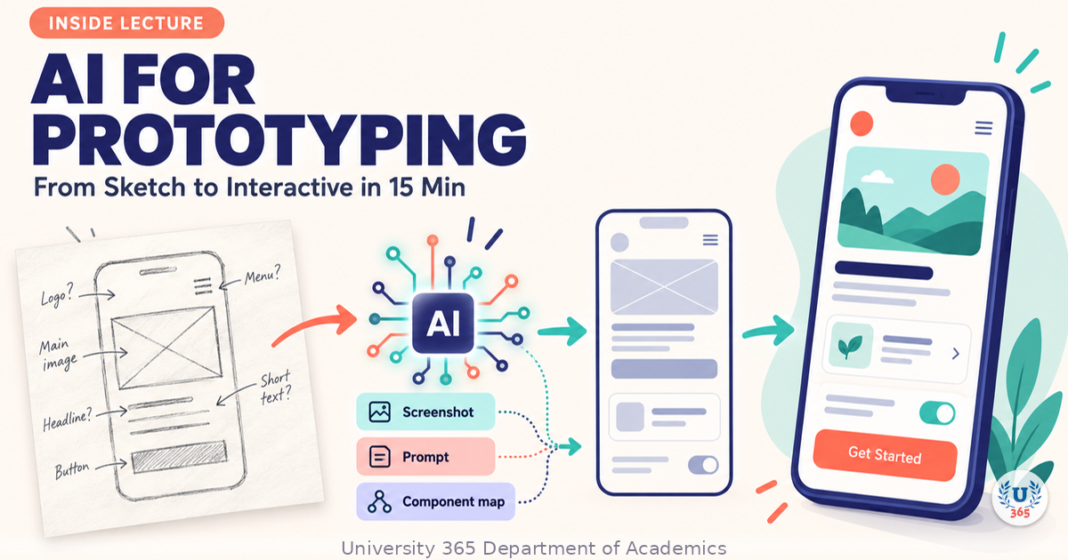
AI for Prototyping: From Sketch to Interactive in 15 Min


UID University 365 Institute of Design
Series UX/UI Design | Level Basic (Free)
Duration 15 to 20 minutes | Access Free
Digital Design, UX/UI, Visual Communication, Motion Graphics, Creative Technology

UNOP Sound (University 365 Neuroscience Oriented Pedagogy)
Take five minutes to prepare your brain. Play the isochronous tone track (40Hz gamma frequency) with your eyes closed. Gamma-frequency tones before a learning session raise attention and make the material easier to absorb.
[Audio player: UNOP Pre-Lecture Isochrone (40Hz, 5 minutes)]
In this Lecture

The Hook: The Sketch That Ships
You draw a screen on paper in three minutes. You photograph it. Twelve minutes later, a colleague on another continent taps a button on your idea, sees the loading state, and tells you the flow breaks on step four.
That is the promise of AI-assisted prototyping, and it is real. The tooling changed between 2021 and 2026. Sketch-to-digital conversion is now a baseline feature in most mainstream design tools, not a novelty. What has not changed is your job: deciding what deserves to be built, what the flow must accomplish, and whether the thing on screen is honest about what the product will do.
In this lecture you will run the full loop, from a photographed sketch to a clickable prototype you can put in front of a user today. You will also see exactly where these tools fail, because a prototype that lies to your team costs more than no prototype at all.
Step 1: What a Prototype Is For
A prototype answers one question at a time. If you cannot state the question in one sentence, you are not ready to prototype.
There are three jobs a prototype does, and they need different fidelity.
Job 1: Test the concept
You want to know whether people understand the idea. You need a clickable path through three to five screens, rough visuals, and real copy. Fidelity below the concept level is wasted effort.
Job 2: Test the flow
You want to know whether people can complete a task without help. You need every screen in the path, correct navigation, loading and empty states, and error messages. This is where most prototypes earn their cost.
Job 3: Test the look
You want reactions to visual direction. You need two or three contrasting style treatments of the same screen, not a fully wired flow. Build the flow later.
Pick one job. A prototype that tries to do all three in fifteen minutes does none of them well.
What the tool changes, and what it does not
AI shortens the mechanical work: turning a photograph into editable rectangles, naming layers, wiring navigation, applying a type scale, generating states you would have forgotten. It does not decide the question, choose the test, or judge whether the output is trustworthy. That judgment is the part you are paid for, and it is the part this lecture trains.
Step 2: From Photo to Editable Wireframe
The first mechanical step converts a hand sketch into structured, editable shapes. The category has a clear origin: the sketch-to-digital conversion feature that Uizard introduced in 2021 is now a baseline expectation, matched by Visily's screenshot-to-UI and by the multimodal input in most mainstream design tools.
The workflow is consistent across tools:
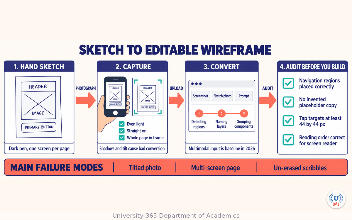
Draw the screen by hand. Use a dark pen on plain paper, keep boxes large, and leave space between elements.
Photograph it straight on, in even light, with the whole page inside the frame. Shadows and perspective are the main cause of bad conversion.
Upload the photo to the tool's sketch or screenshot scanner.
Toggle the result between low fidelity and high fidelity, and pick the one that matches your test.
Three habits that make conversion usable
Draw only what you mean. A scribbled box becomes a component. A crossed-out box becomes a component too, unless you erase it.
Label the elements in words. Writing "primary button" next to a shape usually lands as a label on the component, which saves you renaming later.
Draw one screen per page. Multi-screen photographs confuse the layout detection and produce a merged frame.
Check the conversion before you build on it
The output is a starting point, not a result. Do a thirty-second audit:
Are the navigation regions where you drew them?
Did any placeholder text become real copy the tool invented?
Are the tap targets at least 44 by 44 pixels?
Is the reading order correct for a screen reader?
Fix these now. Every one you leave is a defect your tester will hit and blame on the concept.
Step 3: From Wireframe to Interactive Flow
Converting the sketch gives you screens. Interaction gives you a product. In 2026 you have three routes, and they are not interchangeable.
Route A: Wire the flow by hand
Connect screens with hot spots in a prototype mode. This is the slowest route and the most predictable. Use it when the flow is the thing you are testing, because you will know exactly why every transition happens.
Route B: Describe the behavior and let the tool build it
Prompt the tool with the behavior in plain language and let it generate the screens, the layout, and the navigation. Figma Make, for example, documents this as its core loop: describe the experience, preview it, then refine by prompting again or by editing directly. This is the fastest route from zero to clickable.
Route C: Import an existing design and add motion
If you already have frames, import them and animate the states. This preserves your visual system and gives you interaction without rebuilding screens. Jitter, for instance, imports Figma frames and animates individual layers without recreating the design.
The route that matches a fifteen-minute budget is B for the first pass and A for the correction pass. Generate, then hand-wire only the transitions that carry the test.
Make the prototype honest
An interactive prototype creates a strong impression. Protect your team from it:
Put the fidelity in the product, not the pitch. Do not style the prototype beyond what the real build will reach in the same sprint.
Mark fake data. If the numbers are invented, say so on screen.
Leave the broken states visible. A disabled button and an empty list teach more than a perfect happy path.
Step 4: Prompting a Prototype You Can Actually Click
A prompt that produces a clickable prototype states five things. Leave any one out and you get a screen that looks right and behaves wrong.
The five parts of a prototype prompt
The screen or flow name. "Checkout: cart to confirmation", not "a checkout page".
The entry state. What the user sees first, including what is already in the cart.
The actions available. Name each control and what it does: "Continue to address", "Apply promo code", "Back to cart".
The states to include. Loading, empty, error, and success. Naming these is the single highest-value addition, because models default to the happy path.
The constraints. Layout grid, target device, tone of the copy, and what must not appear.
A worked example
Build a three-screen prototype for a checkout flow on a 390px wide mobile viewport. Screen 1 shows a cart with two items, a subtotal, and a primary button labelled "Continue to address". Screen 2 shows an address form with four fields and a secondary button labelled "Back to cart". Screen 3 shows an order summary with a "Place order" button and a success confirmation. Include a skeleton loading state for the order summary and an inline error state for a declined card on screen 3. Use an 8px spacing grid. Write plain, direct copy. Do not add a loyalty programme or a discount banner.
Correct by pointing, not by regenerating
When the output is close but wrong, do not re-prompt from scratch. Select the element and describe the change:
"Make this button the primary action and the other one secondary."
"Move the error message directly under the card field."
"Reduce this header to two lines."
Regeneration re-rolls everything, including the parts that were already correct. Selection plus a targeted instruction keeps your work. This is the same principle the CI-First workflow applies everywhere: you direct, the tool executes, you keep the decision.
Step 5: The 15-Minute Loop, Step by Step
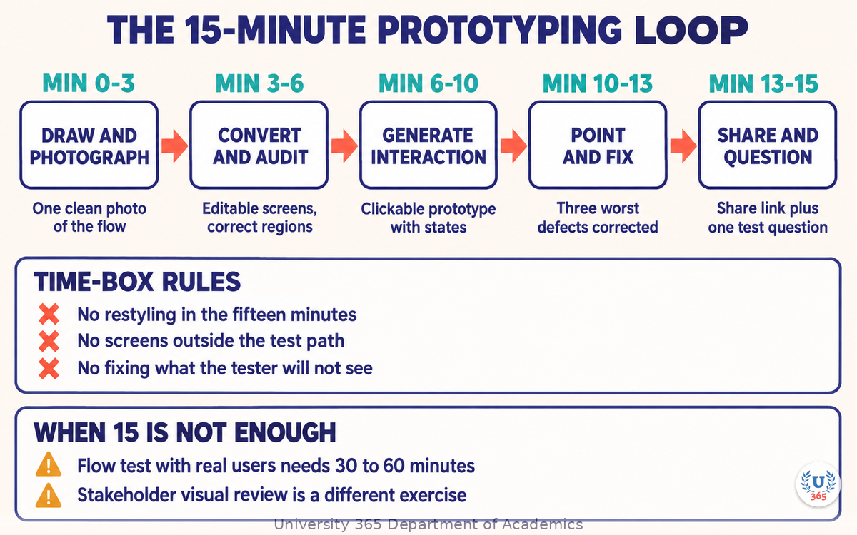
Here is the loop with real time budgets. Fifteen minutes is achievable when the question is narrow and you already have the sketch.
Minute | Step | What you produce |
0 to 3 | Draw and photograph one screen path | A clean photo of the flow |
3 to 6 | Convert, then audit the conversion | Editable screens with correct regions |
6 to 10 | Generate the interactive flow from the five-part prompt | A clickable prototype with states |
10 to 13 | Point-and-fix the three worst defects | A prototype that survives a real test |
13 to 15 | Publish a share link and write the test question | A link and one sentence |
What to time-box hard
Do not restyle. Fifteen minutes does not include visual design. If the test is the concept or the flow, visual polish adds nothing to the answer.
Do not add screens outside the path. Each extra screen is friction for the tester and time you do not have.
Do not fix what the tester will not see. A broken screen three steps off the path can wait.
When fifteen minutes is not enough
Two situations justify slowing down. A flow test with real users needs correct states and realistic copy, which is a thirty to sixty minute job. A stakeholder review needs the visual direction resolved, which is a different exercise. Say which one you are doing before the clock starts, or you will deliver a prototype that answers neither question.
Step 6: What AI Still Gets Wrong
These failures are consistent enough to plan for. Check every prototype against this list before anyone else sees it.
Invented content
The tool will write copy you did not ask for: feature names, price points, legal text, claims. Any text a user reads as product fact must be written or approved by you. Replace invented copy with placeholders that read as placeholders.
Plausible but wrong structure
Generated layouts often look organized while breaking your information architecture: two primary actions on one screen, a filter before the list it filters, navigation that changes position between screens. Compare the structure against your flow diagram, not against how it looks.
Accessibility gaps left open
Generated prototypes routinely miss focus order, contrast, and labelled controls. Run three checks: keyboard-only navigation through the main path, text contrast against the background, and a screen reader pass on the first screen. Fix what fails before the test, or your findings will be about the prototype rather than the concept.
Interaction depth that is faked
A button that changes colour but does nothing is a trap for testers. Either wire the state or remove the control. If you must leave something unfinished, add a visible note on the screen.
Unstated assumptions that harden into requirements
A generated default becomes a decision the moment someone sees it. If the tool chooses a three-field signup form and nobody objects in the review, you now have a three-field signup form. Flag every default you did not choose.
Step 7: Handing the Prototype to Engineers
A prototype that ends as a screenshot wastes the work. Two things make it reusable.
Write the decision log
One page, four lines per decision: what the prototype shows, what the test measured, what you decided, and what changed as a result. Engineers read the decision log, not the prototype. Without it they will treat the prototype as a specification and rebuild states you already rejected.
Give the real assets, not the picture
Where the tool generates code, treat it as a sketch of structure rather than shippable output. Hand over the design tokens, the component names, the content, and the flow diagram. Where the tool produces a runtime animation format, hand over the source file so the team can adjust timing without redoing the animation.
Close the loop with the test result
If a decision log has no test result attached, it is a preference. Attach the outcome: what users did, how many completed the task, what they said that changed your mind. Fifteen minutes of prototyping is only worth it when the result changes a decision, and the log is how that becomes visible.
Feynman Summary: Explain It Like You Are 12
Imagine you want to build a treehouse. Before you buy wood, you draw it on paper so your friends can tell you whether they like it.
Now imagine you can take a photo of your drawing and a machine turns it into a real model you can walk around, open the door of, and climb. Your friends can try it in a minute, and they can tell you the ladder is in the wrong place before you have bought a single plank.
That is what prototyping with AI does. It turns your paper drawing into something people can actually try. It does not tell you whether a treehouse is a good idea, whether your friends will come, or whether the ladder is safe. You decide those things. The machine just makes it fast enough to try before you spend.
One warning. A model that looks like a real house can fool you. Check the door actually opens before you invite everybody over.
Mindmap: The Complete Picture
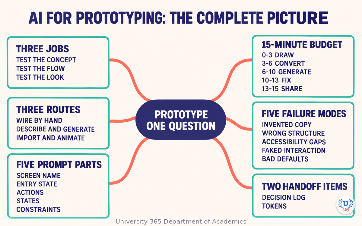
The mindmap sets out the three prototype jobs, the three routes from sketch to interaction, the five parts of a prototype prompt, the fifteen-minute time budget, the five recurring failure modes, and the two artefacts that make a prototype reusable.
UNOP Sound (University 365 Neuroscience Oriented Pedagogy)
Take five minutes to consolidate your memory. Play the isochronous tone track (10Hz alpha frequency) with your eyes closed. Alpha-frequency tones after a learning session support consolidation, helping move what you just learned from short-term to long-term memory.
[Audio player: UNOP Post-Lecture Isochrone (10Hz, 5 minutes)]
Practical Exercise: Sketch to Clickable in 15 Minutes
Exercise: One flow, one question, fifteen minutes
Pick one narrow question. Write it as a sentence: "Can a new visitor find the pricing page from the home screen without help?"
Draw three screens by hand that answer that question. One page each. Dark pen, large boxes.
Photograph each page straight on in even light and crop to the page.
Convert the photos in your design tool's sketch or screenshot scanner.
Audit the conversion with the four checks from Step 2, and fix the regions.
Build the interactive flow with the five-part prompt from Step 4.
Fix the three worst defects by pointing at the element and describing the change.
Publish a share link and write the test question at the top of the prototype.
Run one test with one person. Record where they hesitate and where they stop.
Write the decision log: what you showed, what happened, what you decided.
What to Observe
Which of the five prompt parts did you forget, and what did that cost you in the output?
How many of the five failure modes from Step 6 appeared in your generated flow?
Did the tester hesitate at a point you expected, or somewhere else entirely?
Did the fifteen minutes hold, or did restyling creep in?
Applied AI Connection
You chose the question, drew the screens, audited the conversion, pointed at the defects, wrote the decision log, and ran the test. The tool did the mechanical conversion, layout generation, and state wiring. This is the CI-First principle in a design workflow: HI is the orchestrator, AI is the amplifier, and CI = HI + (AI x HI). The prototype is yours. The speed is the AI's contribution.
Glossary
Term | Definition |
**Prototype** | An early, deliberately incomplete version of a product built to answer a specific question before full development. |
**Fidelity** | The level of detail in a prototype, from rough boxes to near-final visuals and interaction. |
**Sketch-to-digital** | Conversion of a hand-drawn wireframe photo into editable digital UI elements. |
**Wireframe** | A structural layout of a screen showing regions and elements without visual design. |
**Hot spot** | A clickable region on a prototype screen that navigates to another screen. |
**State** | A variation of a screen that depends on data or user action, such as loading, empty, error, or success. |
**Happy path** | The route through a flow where nothing goes wrong. |
**Tap target** | The clickable area of a control. The common minimum is 44 by 44 pixels. |
**Design token** | A named, reusable value for colour, spacing, or type that keeps a product consistent. |
**Decision log** | A short record of what a prototype showed, what the test measured, and what was decided. |
**CI-First** | Co-Intelligence First: the U365 principle that the human orchestrates and the AI amplifies. CI = HI + (AI x HI). |
**UNOP** | University 365 Neuroscience-Oriented Pedagogy, the instructional framework that governs how these lectures are structured. |
Quiz: TEST YOUR UNDERSTANDING
1. What should a prototype answer?
A) Every open design question at once
B) One question, stated in a single sentence
C) Only questions about visual style
D) Only questions the engineers ask
2. Which prompt part is most often omitted and most costly to omit?
A) The device width
B) The screen name
C) The states to include, such as loading, empty, and error
D) The colour palette
3. When a generated screen is close but wrong, what is the better correction?
A) Regenerate the whole flow from a rewritten prompt
B) Select the element and describe the specific change
C) Restyle the screen manually from scratch
D) Accept it and note the issue in the decision log
4. What is the fastest route from zero to a clickable prototype?
A) Wire every transition by hand
B) Describe the behavior and let the tool generate the screens and navigation, then correct
C) Draw each screen at high fidelity before importing
D) Build the front end and click through that
5. What makes a prototype reusable by an engineering team?
A) Sending the share link with no notes
B) Exporting screenshots of every screen
C) A decision log plus the real tokens, component names, content, and flow
D) Adding visual polish so it looks finished
Answers: 1-B, 2-C, 3-B, 4-B, 5-C
Related Resources
U365 INSIDE Publications
UX Research with AI: User Interviews at Scale: Using AI to run and synthesize research at scale
Design Systems Powered by AI: Tokens, documentation, and component variants generated with AI
External Resources
Figma Make: Describe a prototype in natural language and refine it in the same workspace: figma.com
Uizard: Sketch and screenshot conversion into editable wireframes: uizard.io
Visily: Text, screenshot, and sketch to editable wireframe: visily.ai
Jitter: Browser-based motion and interaction design with Figma import: jitter.video
Related U365 Lectures (Coming Soon)
Lecture 7: AI for Accessibility: Designing for Everyone (UID, UX/UI Series)
Lecture 9: AI in Web Design: From Wireframe to Deployed Site (UID, UX/UI Series)
Lecture 5: AI Motion Graphics: Animation Without After Effects (UID, Motion Graphics Series)
U.Copilot for This Lecture
Discuss this lecture with U.Copilot, your AI chat companion trained on this content.
Copy and paste the following prompt into the U.Copilot chat on university-365.com:
You are U.Copilot for Lectures, an AI chat companion trained on University 365 lecture content. You are helping a Fellow who just completed the lecture "AI for Prototyping: From Sketch to Interactive in 15 Min" from the UX/UI Design series at the U365 Institute of Design (UID). Your role is to help the Fellow move from a sketch to a clickable prototype that answers one narrow question. You can: - Clarify any concept from the lecture: the three prototype jobs, the three routes from wireframe to interaction, the five parts of a prototype prompt, the fifteen-minute time budget, and the five recurring failure modes. - Review a prototype prompt the Fellow wrote and identify which of the five parts is missing or vague. - Help the Fellow audit a sketch-to-digital conversion against the four checks. - Suggest which states a specific flow needs, such as loading, empty, error, and success. - Help the Fellow write a decision log that survives a handoff to engineers. - Discuss when fifteen minutes is not enough and the prototype should be scoped differently. Follow the CI-First approach: the Fellow orchestrates, the AI amplifies. Never present generated layout, copy, or structure as a decision. Ask the Fellow to state the question the prototype answers before suggesting any build step. Use context-rich, role-aware responses that account for the Fellow's experience level and the platform they are prototyping for.
Next Steps
Now that you can run the sketch-to-interactive loop, here is what to do next:
Run the practical exercise once with a real question from your current work.
Audit one existing prototype against the five failure modes in Step 6 and fix what fails.
Write a decision log for a prototype you already shared, and attach the test outcome.
Build a prompt template with the five parts from Step 4 saved as reusable text.
Continue the series with "AI for Accessibility: Designing for Everyone" to test your prototype against real accessibility requirements.
Explore the U365 UX/UI tag on INSIDE for more practical design method with the CI-First approach.
The difference between a sketch on paper and a clickable prototype is not the tool. It is the fifteen minutes you decide to spend turning one into the other, with a question worth answering.
IMPORTANT NOTICE
This lecture is published by University 365 as part of its INSIDE Publications Hub. The content is free to read for all visitors. Lectures in this series may be part of a structured academic program leading to a Micro-Credential for your Career (MCC). To enroll in an academic program, visit university-365.com/tuition.
This content is for educational purposes. Tool capabilities change quickly. Verify current features and limits against each vendor's own documentation before you commit a team workflow to them.
Copyright University 365, Inc. All rights reserved. This content is protected under University 365's copyright policies. For permissions or inquiries, contact uda@university-365.com.
Published by the Department of Academics, University 365.
Lecture delivered by the University 365 Institute of Design (UID).
Joe Borazian, Dean of Design, UID
Signed for the academic year 2026.




Comments