
Color Theory and AI: Palette Generation That Works


UID University 365 Institute of Design
Series Visual Communication | Level Basic (Free)
Duration 15 to 20 minutes | Access Free
Digital Design, UX/UI, Visual Communication, Motion Graphics, Creative Technology

UNOP Sound (University 365 Neuroscience Oriented Pedagogy)
Take five minutes to prepare your brain. Play the isochronous tone track (40Hz gamma frequency) with your eyes closed. Gamma-frequency tones before a learning session raise attention and make the material easier to absorb.
[Audio player: UNOP Pre-Lecture Isochrone (40Hz, 5 minutes)]
In this Lecture

The Hook: The Palette That Looks Perfect and Fails
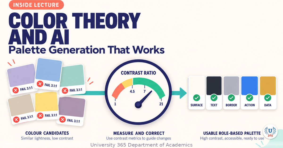
An AI tool gives you five colours in four seconds. They look good together. You paste them into a design system and ship. Three weeks later, support tickets arrive: people cannot read the button labels, charts are indistinguishable in print, and the brand colour disappears against the dark theme.
The palette was never the problem. The palette was never tested.
Colour is measurable. Contrast is a ratio with a formula and a published threshold. Colour blindness has documented prevalence rates and simulated palettes you can check. Print and dark mode have predictable failure modes. Everything that went wrong in that story is detectable in under ten minutes with a contrast checker and three screens.
This lecture teaches you to use AI for the fast part, generating candidate direction, and to apply the measurement yourself. By the end you will have a palette defined by role, proved by ratio, and tested against the failure modes that actually reach users.
Step 1: Why Generated Palettes Fail
Generative colour tools optimise for something specific, and it is not your product.
The optimisation mismatch
These tools are trained and tuned to produce combinations that look harmonious in isolation: an image, a poster, a mood. A product palette has harder constraints. It must carry text at readable contrast, survive in two or three themes, distinguish data series, and hold up in print. A harmony score says nothing about any of that.
Four recurring failure modes
Harmonious but low contrast. Adjacent hues at similar lightness look refined and fail text contrast immediately. This is by far the most common failure.
No semantic separation. Success, warning, and danger colours that sit at similar lightness are indistinguishable to a user scanning a dashboard.
One-theme only. A palette generated against a white canvas has no answer for dark mode, and inverting the lightness breaks the relationships built into it.
Colour-only encoding. A chart that distinguishes series by hue alone fails for the roughly one in twelve men and one in two hundred women with a red-green colour vision deficiency.
The correct division of labour
Let the tool generate candidates. You then assign roles, measure contrast, fix what fails, and prove the result. The generation is four seconds. The validation is ten minutes. Skipping the validation is how the three-week-later ticket arrives.
Step 2: Contrast Is the Non-Negotiable Number
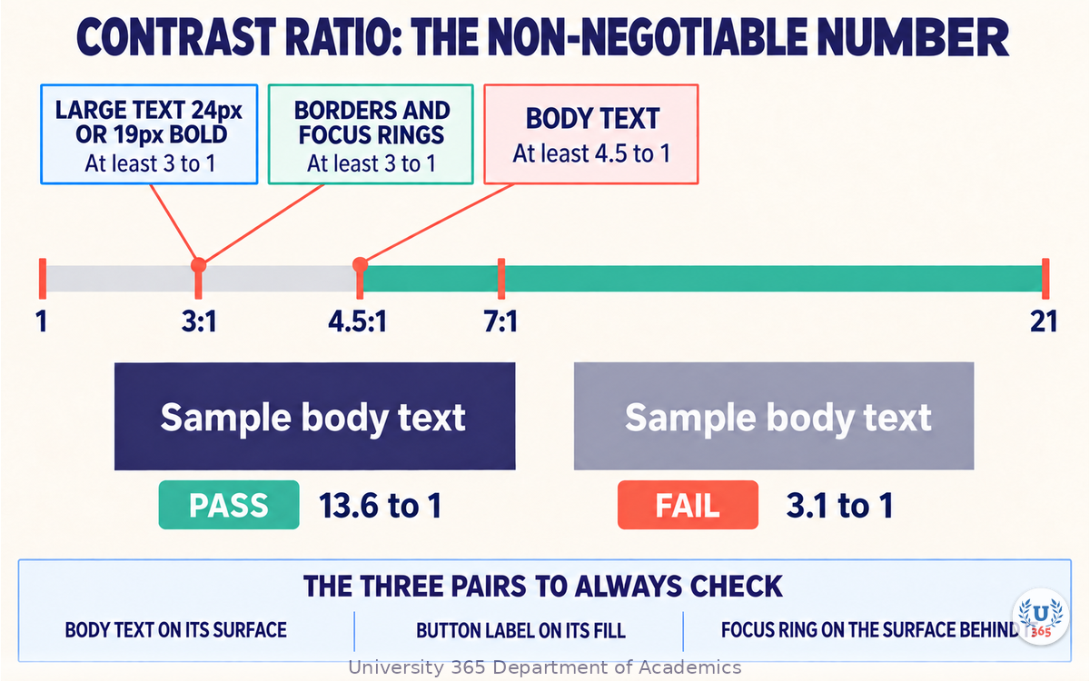
Contrast ratio is a number between 1 and 21. It compares the relative luminance of two colours. Larger means more separation and easier reading.
The thresholds that matter
Use | Minimum ratio | Notes |
Body text on its background | 4.5 to 1 | The standard requirement for normal-size text |
Large text, 24px or 19px bold and above | 3 to 1 | Applies to headings at large sizes |
Interface component boundaries and focus indicators | 3 to 1 | Buttons, input borders, focus rings |
Decorative elements and disabled states | No requirement | Still check them for usability |
Aim above the minimum. A body ratio of 7 to 1 gives you room for the compromises that arrive later, such as an overlay, a muted variant, or a photograph behind the text.
Measure, never estimate
Two colours that look clearly different can land at 3.4 to 1, which fails for body text. Perceived difference and measured contrast diverge constantly, especially between mid-tone hues. Put the hex values into a contrast checker and read the number.
The three pairs you must always check
Body text against its surface.
Primary button label against the button fill.
Focus indicator against the surface behind it.
One quick habit that fixes most palettes
If a pair fails, change the lightness of one colour, not the hue. Nudge the darker colour darker or the lighter colour lighter, then re-measure. Changing the hue usually breaks the harmony you liked and rarely moves the ratio enough to matter.
Step 3: Build the Palette in Roles, Not Swatches
A list of five hex codes is not a palette. A palette is a set of roles with values assigned. Names change the conversation, because a role can be measured and a swatch cannot.
The role set
Role | Purpose | Count |
Surface | Page background and elevated panels | 1 to 2 |
Text | Primary, secondary, and disabled text | 2 to 3 |
Border | Dividers, input outlines, card edges | 1 to 2 |
Primary action | The main call to action and its interaction states | 1 plus 3 states |
Secondary action | Lower emphasis controls | 1 |
Feedback | Success, warning, danger, information | 4 |
Data | Distinguishable series colours for charts | 4 to 8 |
Write the role table before you generate
Fill the role column first and leave the value column empty. Then generate candidates and ask which colour can serve which role. This inverts the usual workflow, where a tool hands you five colours and you spend the afternoon inventing jobs for them.
The interaction state set
Every interactive colour needs at least four values: resting, hover, pressed, and disabled. Generate the resting colour and derive the others by adjusting lightness and saturation in fixed steps you write down, so the behaviour is the same across the product. When these steps are named, they become design tokens and engineering can implement them without asking.
Step 4: Colour Harmony Systems and What They Actually Solve
Harmony systems are useful for generating candidates and useless for validating them. Know what each one does.
The classic relationships
Relationship | How it works | Typical use |
Monochromatic | One hue at several lightness and saturation levels | Calm, restrained interfaces and dark themes |
Analogous | Adjacent hues on the colour wheel | Cohesive, low-tension brand palettes |
Complementary | Opposite hues on the wheel | High emphasis accents against a neutral base |
Split complementary | One hue plus the two beside its opposite | Strong accent with more nuance than a pure complement |
Triadic | Three hues evenly spaced | Playful, high-energy product palettes |
What the systems do not do
None of these relationships says anything about contrast, print fidelity, or how the colours read to someone with colour vision deficiency. Harmony describes the relationship between hues. It does not describe legibility, and it does not describe meaning.
The practical rule for product work
Build a restrained base and spend your emphasis budget in one place. Most successful product palettes are closer to monochromatic plus one accent than to any of the more dramatic relationships. Save the high-tension schemes for campaign work where the surface is static and there is no text to keep readable.
Where AI genuinely helps here
Modern palette tools and models can generate candidate sets against stated constraints: "a monochromatic base in the brand blue with one warm accent, all text pairs at 4.5 to 1 or better". The constraint-based request is far more useful than a mood request, because it moves the validation into the generation step instead of leaving it to you.
Step 5: Prompting a Palette With Constraints
A colour prompt that produces a usable palette states six things.
The six parts of a palette prompt
The brand anchor. The exact hex of a colour that cannot change, such as the primary brand blue.
The relationship. State the harmony explicitly: monochromatic base with a split-complementary accent.
The roles. Ask for roles, not a swatch count: surfaces, text, borders, primary action with states, feedback.
The contrast floor. State the minimum ratios required and which pairs they apply to.
The usage context. Web and mobile product interface, light and dark themes, printed reports.
The exclusions. Colours or families that must not appear, and any colour that is already reserved.
A worked example
Generate a product palette anchored on the brand blue #2B2A6B. Use a monochromatic base derived from that blue, plus warm coral #FF6B57 as the single accent. Return roles, not swatches: two surface colours, three text colours, two border colours, one primary action colour with hover, pressed and disabled values, one secondary action colour, and four feedback colours for success, warning, danger and information. Every text-on-surface pair must reach at least 4.5 to 1 contrast, and every interface boundary must reach at least 3 to 1. The palette must work for a web and mobile product in both a light and a dark theme, and in printed reports. Do not use pure black #000000 or pure white #FFFFFF. Do not include a second accent colour.
Iterate with measurements, not adjectives
Ask for corrections in numbers. "Make the secondary text pass 4.5 to 1 against the light surface" is actionable. "Make it more readable" is not, and the tool will return something that looks different without being measurably better.
Step 6: Test the Palette Before You Ship It
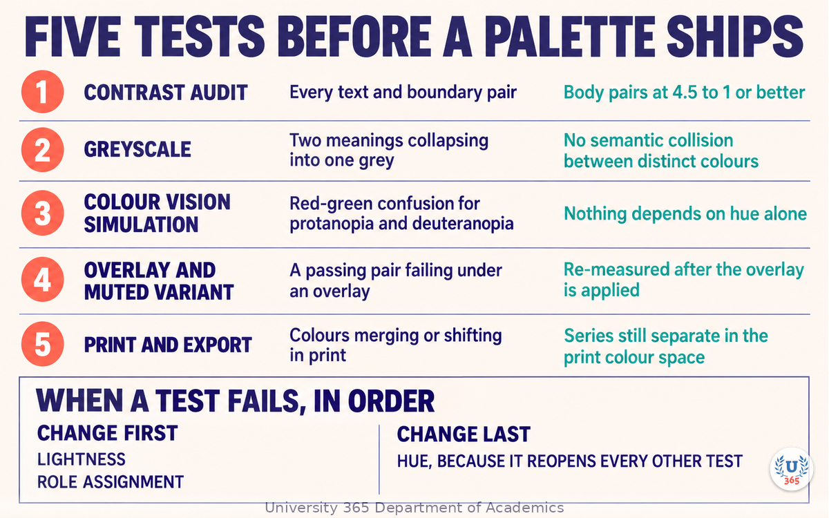
Five tests catch almost everything. Run them on every palette before it enters a design system.
Test 1: Contrast audit
Measure every text-on-surface pair and every boundary pair. Record the ratios in the role table so the next person can see what was proved, not just what was chosen.
Test 2: Greyscale
Convert the palette to greyscale and look at it. If two colours that carry different meanings collapse into the same grey, you have a semantic collision. This is the fastest test for feedback colours.
Test 3: Colour vision deficiency simulation
Run the palette through a simulator for the main deficiency types, protanopia and deuteranopia first. Then confirm that nothing depends on colour alone.
Test 4: The reduced-opacity and overlay test
Apply the muted variant and any overlay the product uses, then re-check the contrast. Overlays are where a passing palette quietly fails, because an overlay changes the effective background under the text.
Test 5: Print and export
For print, convert to the target colour space and look at the result. Saturated blues and greens shift noticeably between screen and print, and colours that separate well on screen can merge on paper.
What to do when a test fails
Change lightness first. If that is not enough, change the role assignment so the failing pair is no longer a pair: move the text to a different surface, or give the element a border instead of relying on fill contrast. The last resort is changing the hue, because that reopens every other test.
Step 7: Dark Mode, Data Colour, and Colour Blindness
Three areas where generated palettes fail most often, and where a small amount of structure solves most of it.
Dark mode is not an inversion
Inverting a light palette produces glare and muddy mid-tones. Build dark mode as its own set of role values:
Use a dark grey surface around #121212 to #1A1A1A rather than pure black, which causes halation and smearing on OLED screens.
Desaturate and lighten accents slightly, because saturated colours appear more intense against dark backgrounds.
Raise the surface elevation by lightening, not by adding a shadow, because shadows are nearly invisible on dark surfaces.
Re-measure every text pair. A pair that passed on white will not automatically pass on a dark surface.
Data colour needs more than hues
For charts, distinguish series by more than colour:
Vary lightness as the primary axis of separation, since lightness survives colour vision deficiency and greyscale printing.
Add a second channel: line style, marker shape, or a direct label on the series.
Cap the categorical palette at around six to eight colours and switch to a sequential ramp beyond that.
Reserve distinct saturation for a meaningful signal, such as the highlighted series, rather than decorating every series.
Colour blindness, by the numbers
Red-green colour vision deficiency affects a substantial share of the population, around one in twelve men and about one in two hundred women from most population estimates. It is common enough that treating it as an edge case is a design error rather than a trade-off.
Design the fix into the palette from the start:
Never encode meaning in hue alone. Pair colour with text, an icon, a shape, or a position.
Keep the lightness separation between meaningful pairs above the level where they collapse in simulation.
Keep the required contrast ratios for text and boundaries, since contrast helps regardless of hue perception.
Test with real users where you can
A simulator catches structural failures. It does not tell you whether your specific audience reads your specific palette comfortably. Where the product reaches a broad audience, put the palette in front of people who use it.
Feynman Summary: Explain It Like You Are 12
Imagine you are choosing the colours for a school poster. You pick five colours that look nice together. Then you print it, and nobody can read the small text.
The colours were not ugly. They just were not checked.
It is like picking teammates for a race by how fast they look, without timing them. A colour that looks dark and a colour that looks light can actually be almost the same brightness, and then the words disappear into the background. The only way to know is to measure.
So do this: let the computer give you lots of colour ideas, because it is very fast at that. Then measure them yourself. Check that the words can be read, check them in dark mode, check them in a photocopy, and check that a friend who sees colours differently can still tell your chart lines apart. Speed from the machine, judgment from you.
Mindmap: The Complete Picture
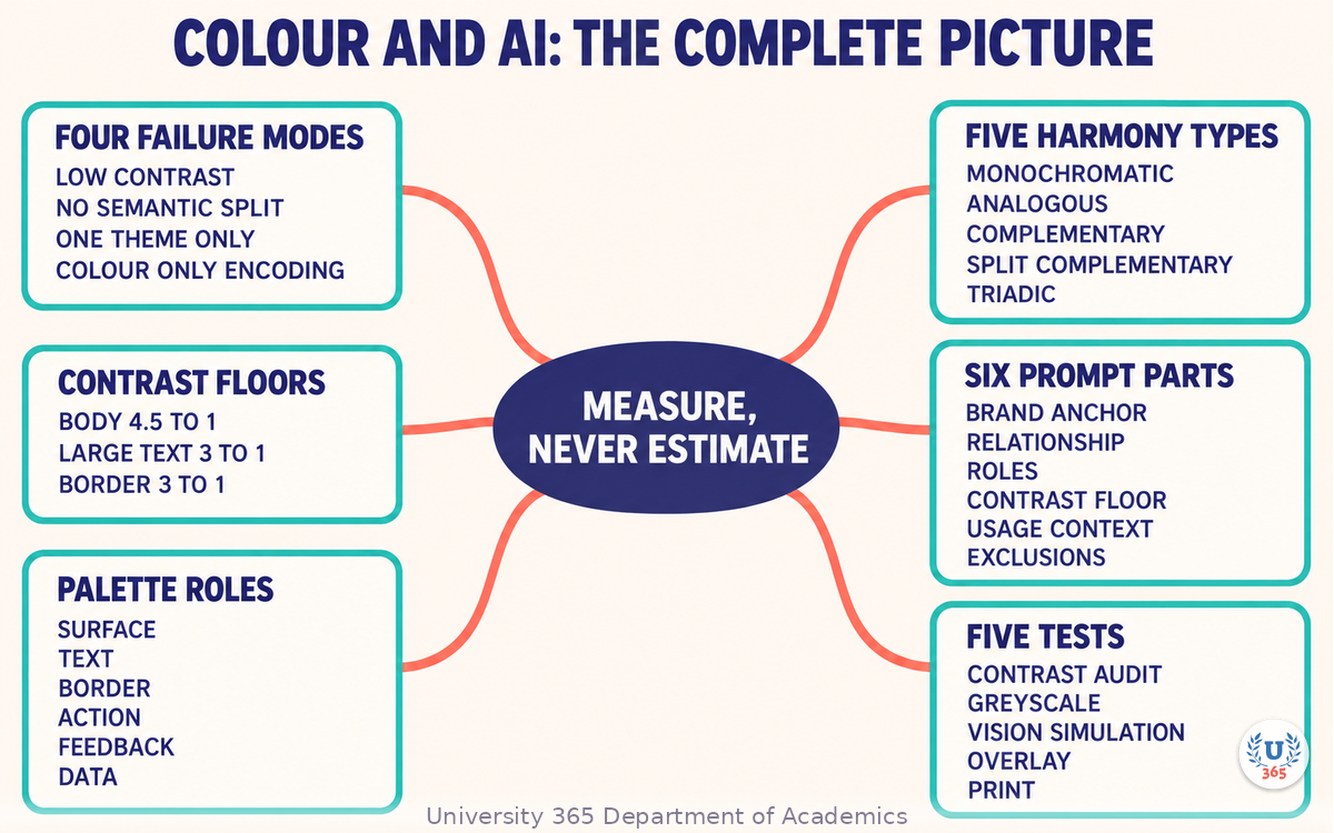
The mindmap sets out the four failure modes of generated palettes, the contrast thresholds and the three pairs to check first, the palette role table, the five harmony relationships and what they do not solve, the six parts of a palette prompt, and the five tests a palette must pass.
UNOP Sound (University 365 Neuroscience Oriented Pedagogy)
Take five minutes to consolidate your memory. Play the isochronous tone track (10Hz alpha frequency) with your eyes closed. Alpha-frequency tones after a learning session support consolidation, helping move what you just learned from short-term to long-term memory.
[Audio player: UNOP Post-Lecture Isochrone (10Hz, 5 minutes)]
Practical Exercise: Generate, Correct, and Prove a Palette
Exercise: One palette, five tests, one role table
Pick the brand anchor. Take the primary colour of a project you are working on, or use #2B2A6B.
Write the role table first, with the role names from Step 3 and no values.
Generate candidates with the six-part prompt from Step 5, stating the contrast floor.
Measure every text pair in a contrast checker and record each ratio in the role table.
Fix the failures by changing lightness. Re-measure after each change and log the before and after.
Run the greyscale test and note any semantic collision between feedback colours.
Run a colour vision deficiency simulation for protanopia and deuteranopia.
Build the dark theme values and re-measure every pair against the dark surfaces.
Apply the product's overlay to one text pair and re-check the ratio.
Convert one page to a print colour space and check that the palette still separates.
What to Observe
How many of the generated pairs passed the contrast floor on first output? Record the number.
Which failures needed a lightness change, and which needed a role reassignment instead?
Did any two feedback colours collapse in greyscale?
Which series in your data palette would be indistinguishable in a simulation, and what second channel did you add?
Applied AI Connection
You set the anchor, chose the relationship, wrote the contrast floor, measured every pair, corrected the failures, and proved the result across themes, vision types, and print. The tool produced candidate sets at a speed no person can match. This is the CI-First principle in colour work: HI is the orchestrator, AI is the amplifier, and CI = HI + (AI x HI). Colour that carries meaning and survives measurement is a human decision. The candidate generation is the AI contribution.
Glossary
Term | Definition |
**Contrast ratio** | A number between 1 and 21 comparing the relative luminance of two colours. |
**Relative luminance** | A measure of how much light a colour emits, used as the basis of contrast ratio. |
**Palette role** | A named function in a design system, such as surface, text, or primary action, to which a colour value is assigned. |
**Design token** | A named, reusable value for colour, spacing, or type that keeps a product consistent. |
**Monochromatic** | A palette built from one hue at several lightness and saturation levels. |
**Analogous** | A palette built from hues adjacent to each other on the colour wheel. |
**Complementary** | A palette pairing hues opposite each other on the colour wheel. |
**Split complementary** | A palette using one hue plus the two hues beside its opposite. |
**Triadic** | A palette using three hues evenly spaced around the colour wheel. |
**Semantic colour** | A colour reserved for a meaning, such as success, warning, or danger. |
**Protanopia and deuteranopia** | Common forms of red-green colour vision deficiency. |
**Sequential ramp** | An ordered series of colours varying mainly in lightness, used for continuous data. |
**CI-First** | Co-Intelligence First: the U365 principle that the human orchestrates and the AI amplifies. CI = HI + (AI x HI). |
Quiz: TEST YOUR UNDERSTANDING
1. What do generative colour tools typically optimise for?
A) Text contrast against every surface
B) Combinations that look harmonious in isolation
C) Print colour fidelity
D) Colour vision deficiency safety
2. What is the minimum contrast ratio for normal-size body text?
A) 2 to 1
B) 3 to 1
C) 4.5 to 1
D) 7 to 1
3. A pair fails the contrast check. What should you change first?
A) The hue of one colour
B) The lightness of one colour, then re-measure
C) The font size, to make the text count as large text
D) Nothing, since the colours look clearly different
4. Why should dark mode not be built by inverting a light palette?
A) It is technically impossible in most tools
B) Inversion creates glare and muddy mid-tones, so dark mode needs its own role values
C) It always breaks the brand colour
D) It is only a problem for print
5. Which second channel makes a chart readable without relying on hue alone?
A) A gradient fill on every series
B) Line style, marker shape, or a direct label on the series
C) A larger legend
D) Saturated background colours behind each series
Answers: 1-B, 2-C, 3-B, 4-B, 5-B
Related Resources
U365 INSIDE Publications
AI Motion Graphics: Animation Without After Effects: Animating the states your palette has to survive
Design Systems Powered by AI: Turning role-based colour into tokens and components
External Resources
Web Content Accessibility Guidelines: The published contrast requirements and their definitions: w3.org
Coolors: Fast palette generation and contrast checking: coolors.co
Adobe Color: Colour wheel relationships and accessibility tools including colour blindness simulation: color.adobe.com
Colour Contrast Analyser: A desktop checker for ratios and simulations: tpgi.com
Related U365 Lectures (Coming Soon)
Lecture 8: Generative Brand Identity (UID, Creative Technology)
Lecture 7: AI for Accessibility: Designing for Everyone (UID, UX/UI Series)
Lecture 9: AI in Web Design: From Wireframe to Deployed Site (UID, UX/UI Series)
U.Copilot for This Lecture
Discuss this lecture with U.Copilot, your AI chat companion trained on this content.
Copy and paste the following prompt into the U.Copilot chat on university-365.com:
You are U.Copilot for Lectures, an AI chat companion trained on University 365 lecture content. You are helping a Fellow who just completed the lecture "Color Theory and AI: Palette Generation That Works" from the Visual Communication series at the U365 Institute of Design (UID). Your role is to help the Fellow generate a palette and then prove it. You can: - Clarify any concept from the lecture: the four failure modes of generated palettes, contrast thresholds, palette roles, the five harmony relationships and their limits, the six parts of a palette prompt, and the five tests. - Review a palette prompt the Fellow wrote and identify which of the six parts is missing or vague. - Work through a specific failing colour pair with the Fellow and suggest lightness changes to reach the required ratio, explaining why lightness is changed before hue. - Help the Fellow build the interaction state values for a primary action colour. - Help the Fellow build a dark theme role set rather than inverting the light one. - Suggest a second channel for a chart that currently relies on hue alone. Follow the CI-First approach: the Fellow orchestrates, the AI amplifies. Never present a generated palette as finished. Always ask the Fellow to state the required contrast ratios and the usage context before suggesting any values, and always ask for the measured ratio after a change. Use context-rich, role-aware responses that account for the Fellow's experience level and the product they are designing for.
Next Steps
Now that you can generate a palette and prove it, here is what to do next:
Run the practical exercise on a live project and record the first-pass pass rate of the generated pairs.
Convert your palette into named tokens with the interaction state steps written down.
Build the dark theme role set and re-measure every text pair against the dark surfaces.
Audit one existing chart and add a second channel to any series distinguished only by hue.
Check one pair under your product's overlay, since that is where passing palettes quietly fail.
Explore the U365 Visual Communication tag on INSIDE for more practical design method with the CI-First approach.
The colours are the fast part. The measurement is the work that makes them usable, and the measurement is the part that stays yours.
IMPORTANT NOTICE
This lecture is published by University 365 as part of its INSIDE Publications Hub. The content is free to read for all visitors. Lectures in this series may be part of a structured academic program leading to a Micro-Credential for your Career (MCC). To enroll in an academic program, visit university-365.com/tuition.
This content is for educational purposes. Accessibility standards and tool capabilities are updated over time. Verify the current published thresholds and the current features of any tool before you rely on them for a professional deliverable.
Copyright University 365, Inc. All rights reserved. This content is protected under University 365's copyright policies. For permissions or inquiries, contact uda@university-365.com.
Published by the Department of Academics, University 365.
Lecture delivered by the University 365 Institute of Design (UID).
Joe Borazian, Dean of Design, UID
Signed for the academic year 2026.




Comments